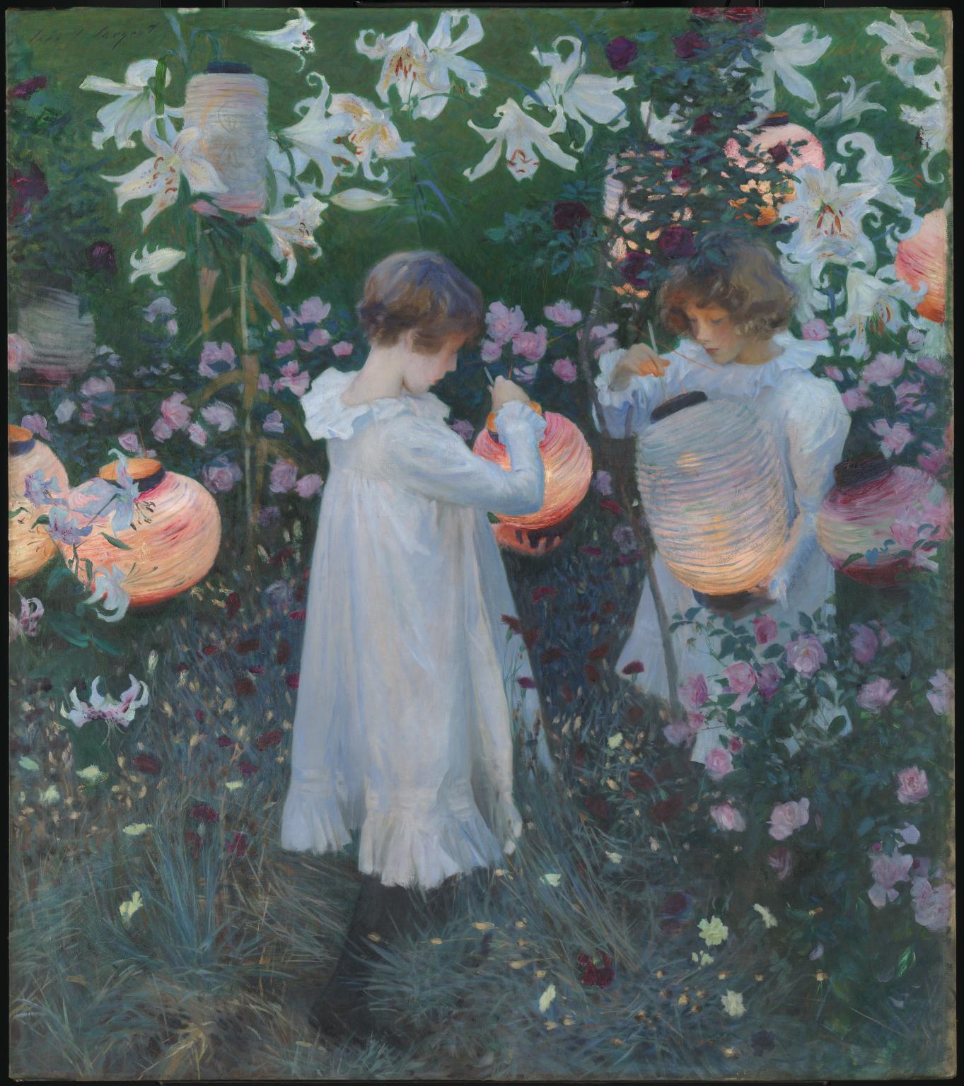
All About Colour Theory
We often hear about the importance of colour theory in art and how it is used by artists to create contrasts and harmonies in painting. Perhaps you know what the colour wheel is and you have heard of primary, secondary, and tertiary colours, but don't understand how this knowledge can be used in artistic practice. Colour has been proven to not only influence how we focus on pieces of art, but it can also control our behaviour through advertising and branding. With decorative and vintage artworks from here at Collins & Green Art, as well as famous pieces by artists such as Vincent van Gogh, this article explores the fundamental facts of colour theory and how artists use them to influence the viewer's focus on certain aspects in a painting to affect their experience of art pieces. Later in the article, we will also look at the works of Robert and Sonia Delaunay, abstract artists from who pioneered the use of modern colour theory in their works from the early 20th century.
The Colour Wheel
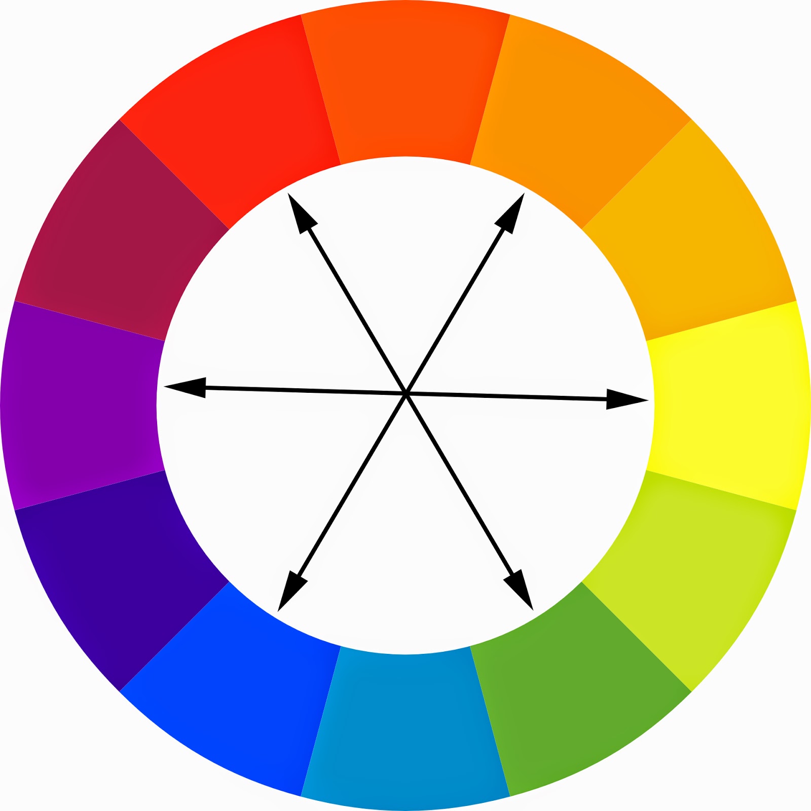
The base of all colour theory is the colour wheel, pictured here. The 18th century polymath Johann Wolfgang Goethe popularised colour theory creating his own colour wheel which greatly influenced how artists have used colours ever since. This is not to say that artists beforehand were not aware of the power of colour; Aristotle published his treatise On Colours in 322 BCE, and Sir Isaac Newton published findings on light refraction and colour prisms in the 1660s.
A colour's position on the wheel determines its colour harmonies; colours opposite each other in the wheel are complimentary colours, and colours next to each other are analogous. These colour harmonies will be explored later in more detail.
Primary, Secondary, and Tertiary Colours

The labels of primary, secondary, and tertiary colours relate to the stages of colour that are combined to create new colours. For instance, the primary colours of red, yellow, and blue can be combined in different ways to create the secondary colours of green, orange, and purple. Tertiary colours are the colours created when secondary and primary colours are mixed; red, yellow, and blue cannot be created by mixing colours but can be made to appear lighter or darker to create a tertiary colour.
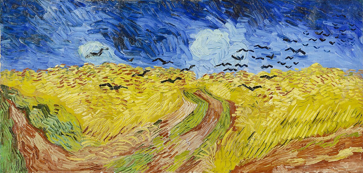
'Wheatfield with Crows' by Vincent Van Gogh, 1890. Oil on canvas, on display at the Van Gogh Museum, Amsterdam, Netherlands.
An artist renowned for using primary colours is Vincent van Gogh and his signature use of the contrasting primary colours blue and yellow. In Wheatfield with Crows Van Gogh adds hints of red tones to use the entire primary field. Notice however that Van Gogh rarely uses strong red hues in his works; often, artists will have specific colours that they refrain from using or find difficult to work with.
Colour Properties
The three main colour properties can be separated into: hue, value, and intensity. The hue is the actual colour itself and where it resides on the colour wheel, whether this be red, green, yellow etc. The value of colour is determined through the colour's lightness or darkness; toning, tinting, and shading is achieved by adding white, grey, or black. Finally, a colour's intensity is based on the saturation of the hue; a colour which has not had a complementary colour or a neutral colour added has a high saturation. For clarity, these ideas will be explored in the images below:

'Heather Landscape' signed Frithiof Berglund (1905-1973), dated 1948. Oil on canvas. Available at Collins & Green Art, click the image for more information.
Notice how this painting uses a mixture of primary and secondary colours to create its vibrant effect. A colour harmony is created through the mixture of pink, blue, and purple tones; purple is mixed with the brown, marking the boundaries of the coastline. The green and purple here are the most intense colours in this artwork, with these colours also having a high colour value, despite the understated tone of the work. Berglund was part of an informal group of artists known as the Gothenburg Colourists, and was famed for his skillful manipulation of colour.
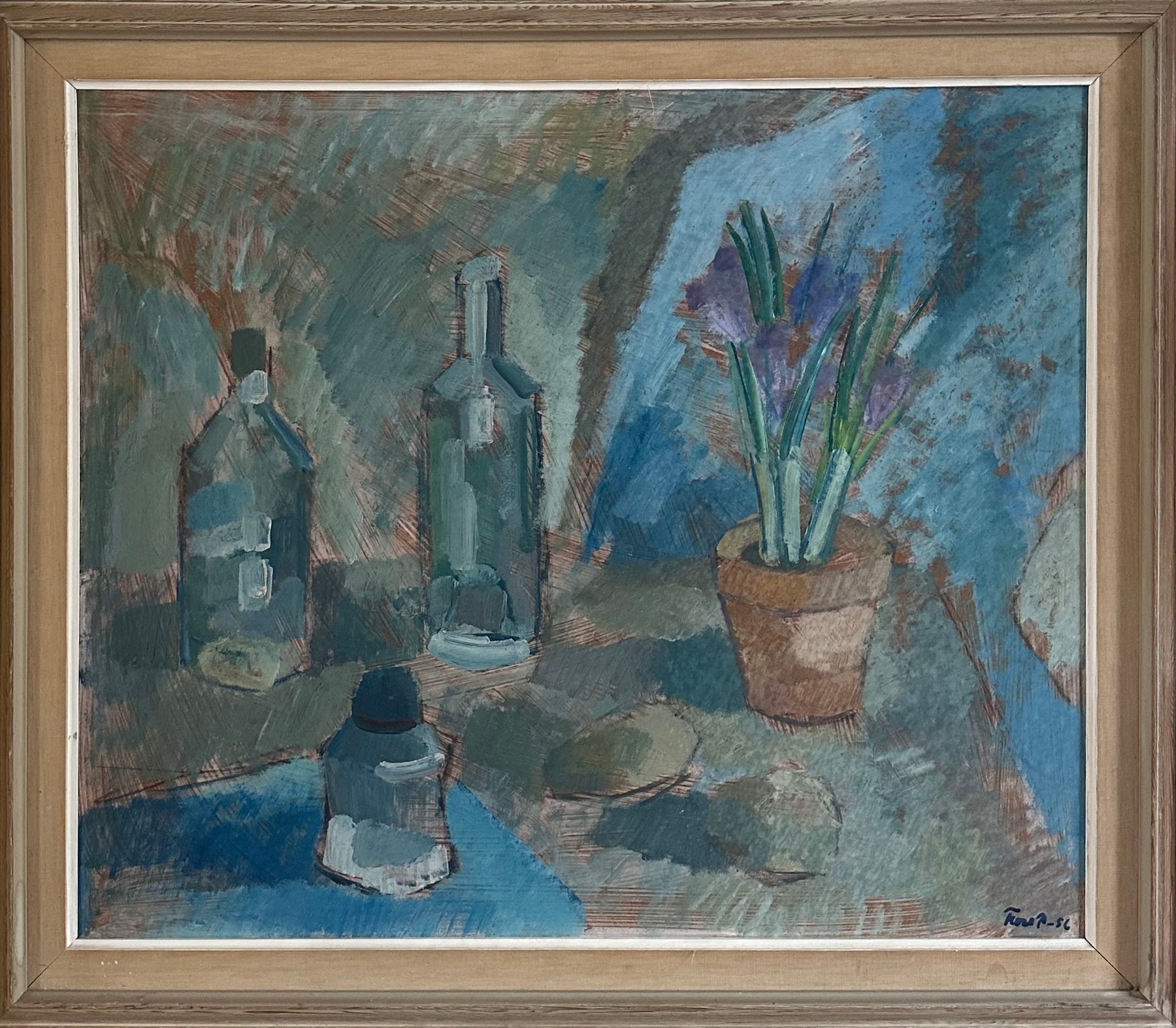
'Still Life with Crocus' signed Ture P(ettersson), dated 1956, oil on board. Available at Collins & Green Art, click the image for more information.
Notice the dramatic colour contrast between this painting and the one before; the colours are deeply harmonious through the artists' analogous choice of blue and grey colours, and the painting's value has been created through dark shading of the colours.
Colour Harmonies

'Swedish Dahlias' signed Edgar Wallin, dated 1948. Oil on board in vintage gold frame. Notice the triadic colours used in this bouquet. Available at Collins & Green Art, click on the painting for more information.
Colour harmonies refer to the relationship between different colours, especially in an artwork. Certain colour harmonies include complimentary, monochromatic, and triadic. Complimentary colours, as stated earlier, are colours which are opposite each other on the colour wheel. Monochromatic describes a range of colours which are of the same hue but have different tones and values. Triadic describes colours which are not next to each other but form a triangle in the colour wheel, e.g. red, yellow, and blue.
The painting above uses a plethora of colours based around the triadic primary colours to create a range of vibrancies and contrasts. This full range of saturated colours in the flowers is also contrasted by the toned-down, neutral colour of the background created using browns, yellows and greens.
How the Delaunays used Colour Theory

Rhythm Colour no. 1076 (1939) by Sonia Delaunay, Centre National des Arts Plastiques/Fonds National d’Art Contemporain, Paris
One of the most influential couples in the history of art, Robert and Sonia Delaunay are known for their colourful, abstract paintings which consist of the full spectrum of colour within geometric forms, created in the early to mid-20th century. They were inspired by the scientist Michel-Eugène Chevreul, of whom is better known as the founder of modern organic chemistry, but was also a pioneering colour analyst who was the director of dyes at the national textile factory in Paris for the Gobelins company. In 1839, he published The Principles of Harmony and Contrast of Colours and their Application to the Arts, a paper which highlighted his discovery that the vibrancy of colours is influenced by the colours that surround them, creating what we understand today as the optical illusions called 'simultaneous contrasts'.

One of Cheveul's illusions; notice how the central bar seems to have a gradient of its own? Cover the gradient surrounding the bar and see how this changes.
The illustration above informs our understanding of Sonia Delaunay's use of colour, as seen in Rhythm Colour no. 1076. The grey circular areas look lighter or darker than each other depending on the tone they are surrounded by. This relationship between colours and their vibrancy is experimented with throughout the piece, with repeating oranges, blues, and greens on the bottom-right hand side all being influenced by each other. This pioneering theory continued to be experimented with in vintage and decorative artworks throughout the 20th century, as well as certainly influencing the contemporary art we see today.

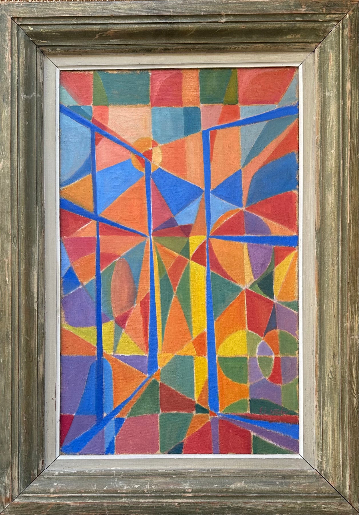
'Orange and Daisies' signed Göte Bjerther, oil on canvas, available at Collins & Green Art. Click the image above for more information.
The way this vintage painting experiments with geometry and colour is similar to the Delaunay's; notice how the colour wheel background and are distinguishable thanks to the horizontal lines of the table top. In other words, despite both sections of the painting not consisting of any pattern of colours seen in real life, lines of geometry and perspective give the painting depth. The artist has also chosen to repeat the colours of the orange and the vase of flowers, creating a coherency throughout the piece. For example, an orange block is seen to the right of the vase which reflects the orange itself, and the blues in the reflections on the vase are seen around the centre of the colour wheel. This painting is a brilliant example of composition, proving that what often seems to be in our eyes an accident or coincidence in art marking has instead been thoroughly planned out instead.
Final Thoughts
'Abstract Window' signed E. Schroder (1917-1954), oil on canvas, available at Collins & Green Art. Click the image for more information. Notice how the artist uses a wide range of vibrant colours in this artwork.
An understanding of colour theory is essential for artists and art enthusiasts alike, informing both artistic practice and how we as viewers look at art. Artists can affect how we view art through colours influencing which area of a painting holds our attention, and this is only really achieved through an understanding of colour theory. Often, the use of colour and the effect of it is entirely subconscious, but perhaps now you can describe artworks with some of these keywords mentioned, enhancing your artistic vocabulary.
Written by Eloise Saggers, Collins & Green Art